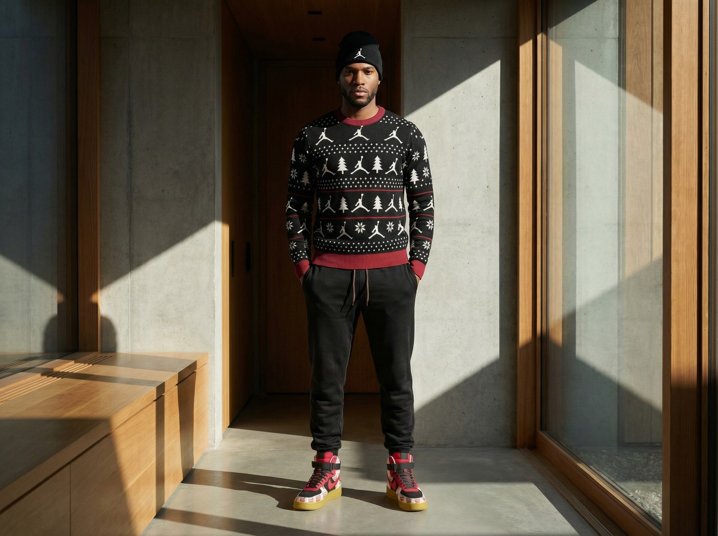
Theoretical · Apparel · Color
NIKE WOMEN'S FALL
Seasonal Color & Apparel Concept · Self-Initiated
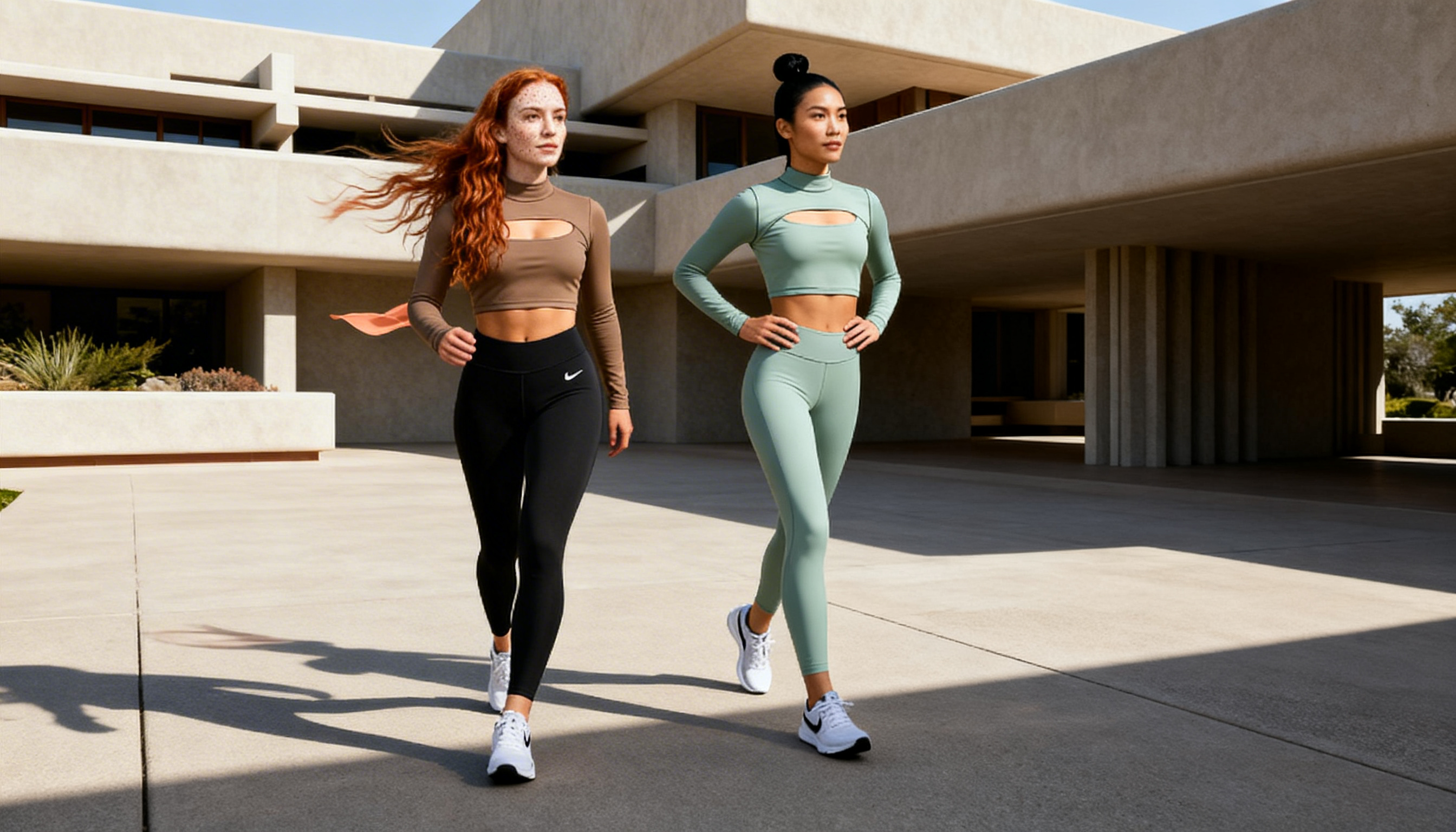
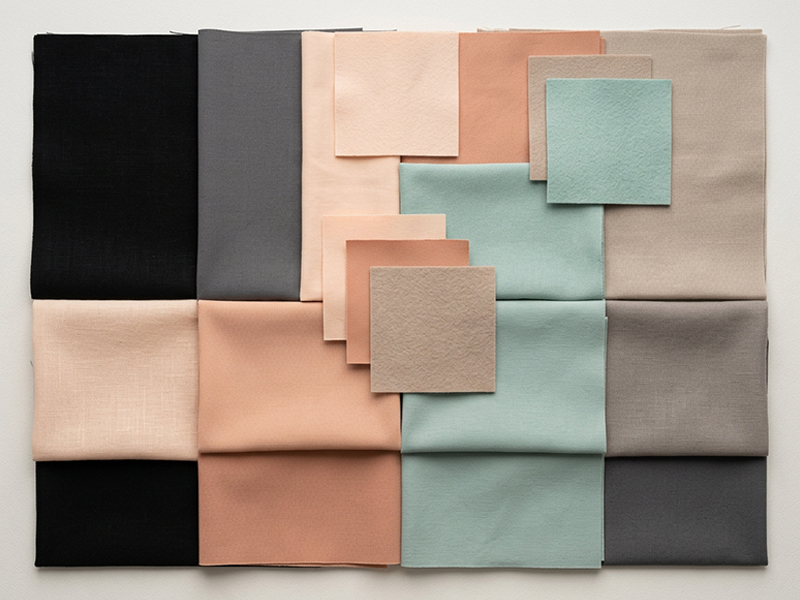
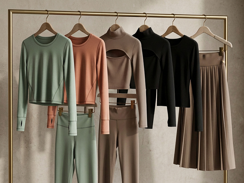
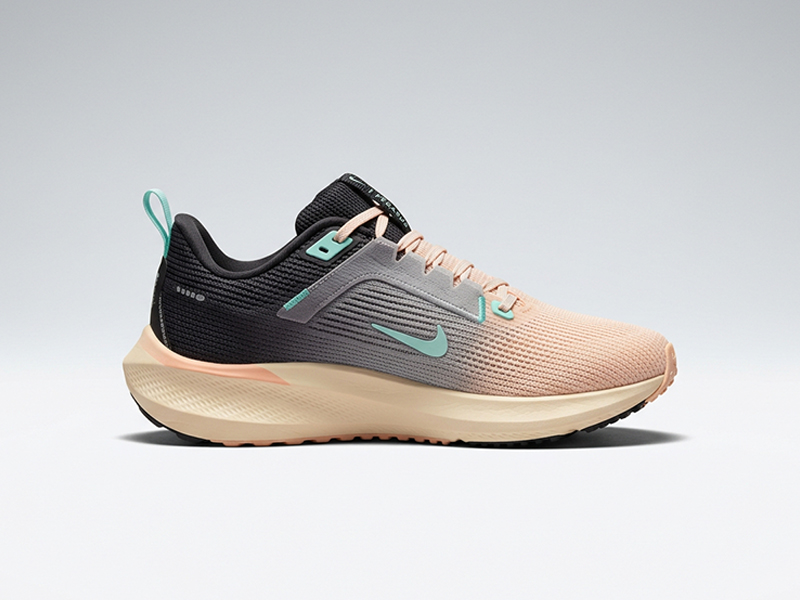
Color Story
Black · Slate · Peach · Blush
Seafoam · Warm Stone · Taupe Fall neutrals, soft skin tones, and one cool seafoam hit to keep it fresh.
Seafoam · Warm Stone · Taupe Fall neutrals, soft skin tones, and one cool seafoam hit to keep it fresh.
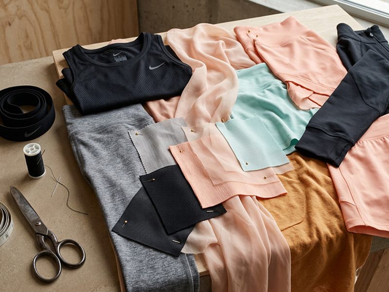
A self-initiated fall concept for Nike Women's, built to show how color, culture, and product work as one system. The process mirrors real in-house development: cultural research, moodboarding, palette building, graphic direction, and product application.
The goal was to show the full arc of thinking, not just polished mockups, but the decisions behind them. Why this palette. Why this material direction. Why these graphics on these silhouettes. The same decision-making that turns inspiration into product people buy and wear.